FERTILE GUT — Brand Identity & Packaging Design
Science-Backed Wellness, Designed for Real Life
A comprehensive branding refresh and packaging system for Fertile Gut, elevating their science-backed formulations into an empowering, modern wellness experience for women at every stage.
PROJECT SERVICES
★ Rebrand Package A: The Facelift
★ Add-on: Packaging Design
THE CONTEXT
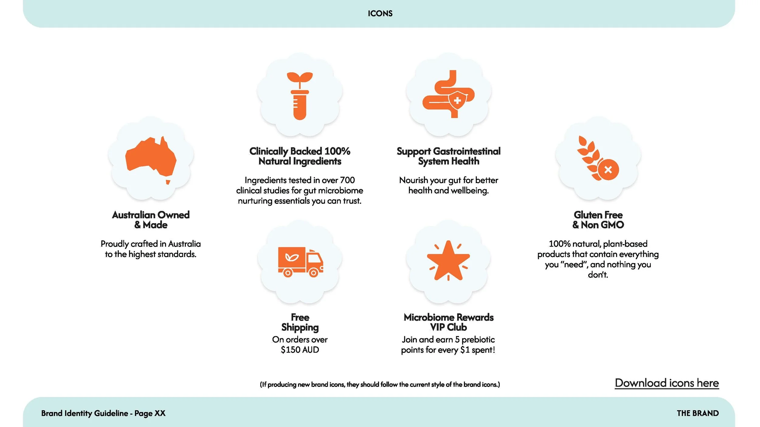
Fertile Gut exists to help women understand and support their gut and hormonal health at every stage of life. Their formulations are clean, plant-based, and heavily researched. However, the brand needed an identity that matched the efficacy of their products.
THE CHALLENGE
The wellness market is saturated with brands that are either too clinical (feeling medicinal) or too fluffy (lacking scientific credibility). Fertile Gut needed to find the middle ground. The challenge was to create an identity that felt intelligent but not clinical, empowering but not performative, and stylish without sacrificing substance.
PHASE 1: THE STRATEGY
A Warm,
Clinical Approach
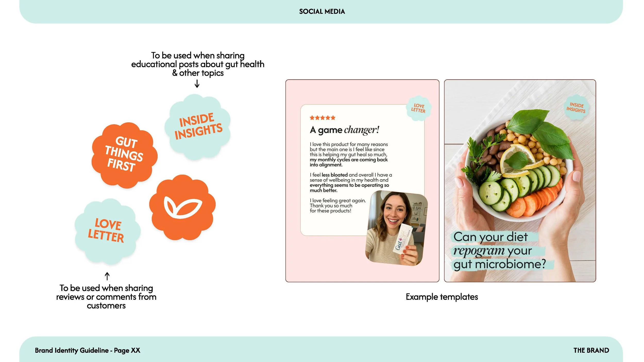
We anchored the brand strategy in the concept of "Warm but Clinical". The goal was to make Fertile Gut feel like a blend of a trusted nutritionist and your softest self-care friend. The tone of voice is designed to be confident but not loud, and knowledgeable but never preachy. It’s about translating complex microbiome science into simple, confident choices.
PHASE 2: THE IDENTITY SYSTEM
Familiar, Yet Elevated:
The Power of a Refresh
Not every rebrand requires tearing down what already works. Fertile Gut had an existing, loyal customer base that recognised their logo. Instead of starting from scratch and losing that hard-earned brand equity, we chose to strategically refine the existing mark.
We simplified and tightened the visual hierarchy. By removing the old tagline and moving the leaf motif to act as a signature accent alongside "fertile," we created a much more cohesive and visually balanced lockup.
More importantly, we shifted the emphasis. The word "GUT" is now bold and prominent, directly reflecting the brand's core focus: the gut is the foundation of overall wellness.
PHASE 3:THE PACKAGING REVEAL
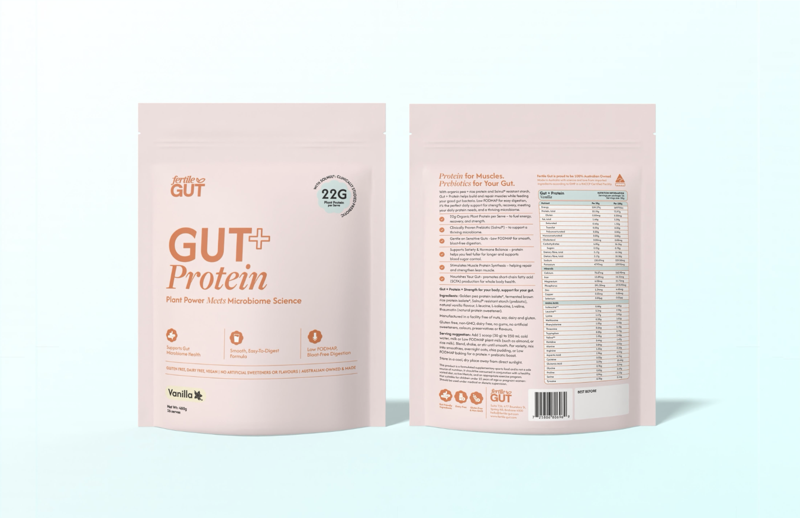
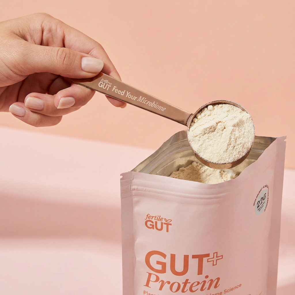
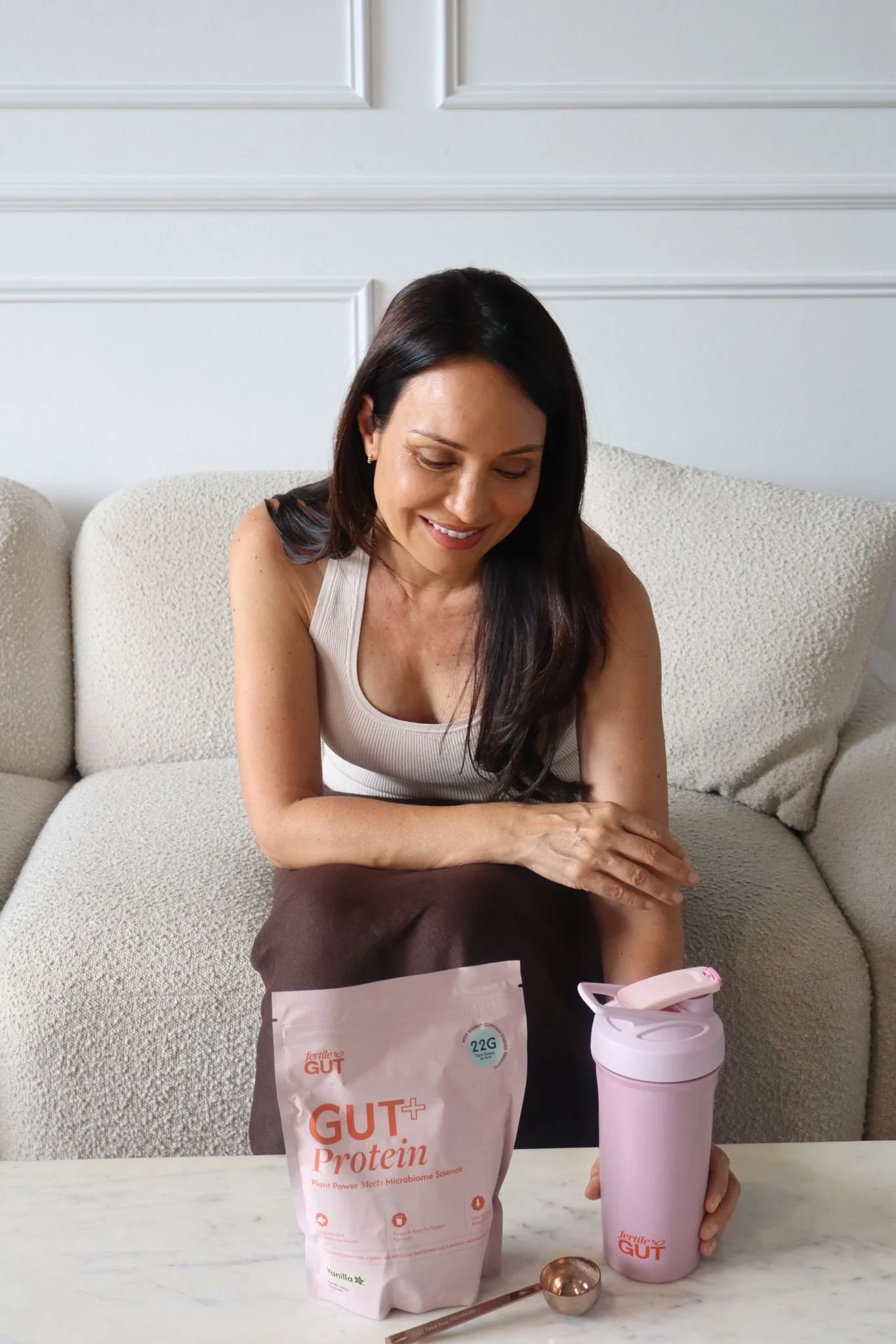
Gut + Protein
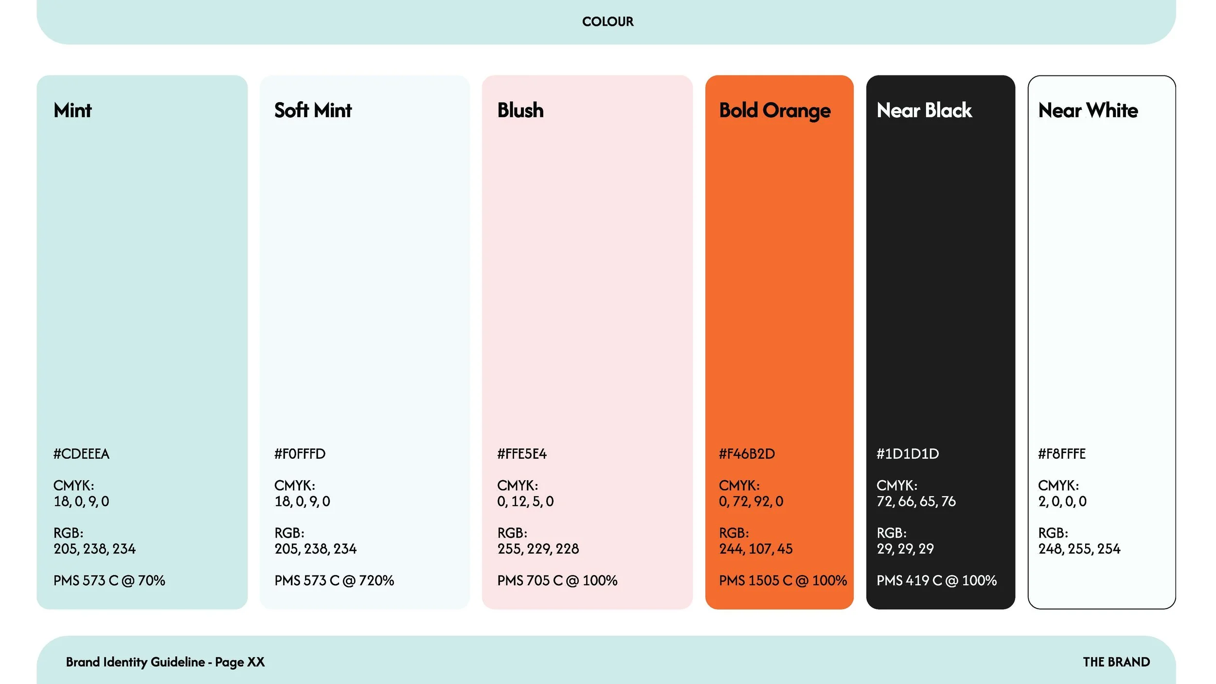
The new visual identity was immediately put to work on the launch of the Gut + Protein product. We needed the packaging to stand out on a crowded shelf while remaining clean and informative. The soft blush background paired with the bold orange logo creates a striking, modern contrast that feels both luxurious and approachable.
To celebrate the launch of Gut + Protein, we also designed a custom PR Mailer that turns an ordinary delivery into an educational brand experience.