SUNDAE BODY: REWARDS PROGRAM — Branding & Web Design
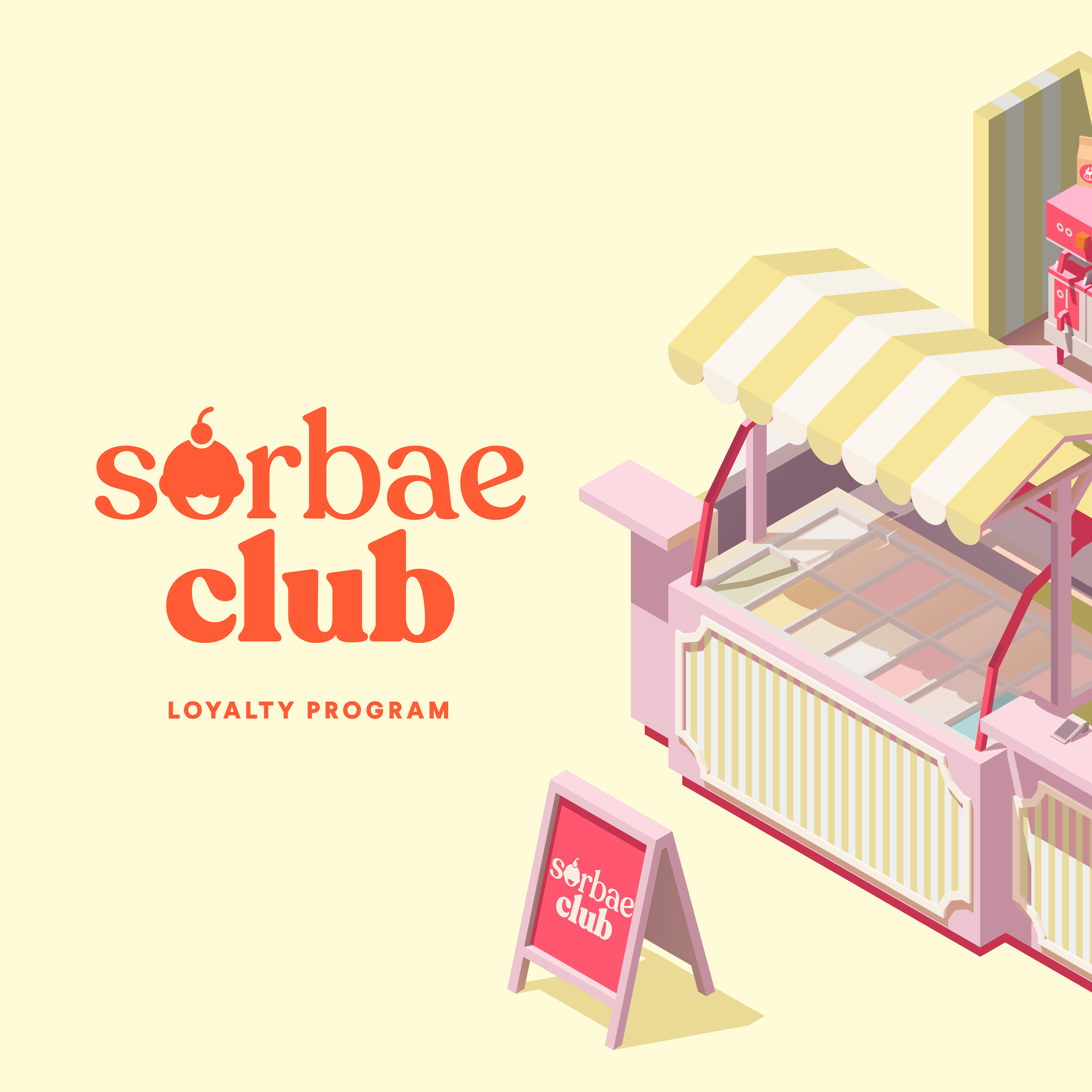
Welcome to the Sorbae Club: A Sweet Take on Loyalty
A gelato-inspired design direction and digital launch campaign for Sundae Body’s highly anticipated customer rewards program.
PROJECT SERVICES
★ Ongoing Design Retainer
★ Experience the site here

THE CONTEXT
With a rapidly growing cult following, Sundae Body was ready to launch their customer loyalty program. The client came to us with the name: the "Sorbae Club”, and the tier levels. So we brought this concept to life online.
THE CHALLENGE
Loyalty programs can easily feel like boring, transactional spreadsheets. The challenge was to make earning points feel as fun, tactile, and satisfying as dispensing Sundae's signature whipped body wash. We needed to build a digital world that customers actually wanted to "level up" in.
PHASE 1: THE DESIGN DIRECTION
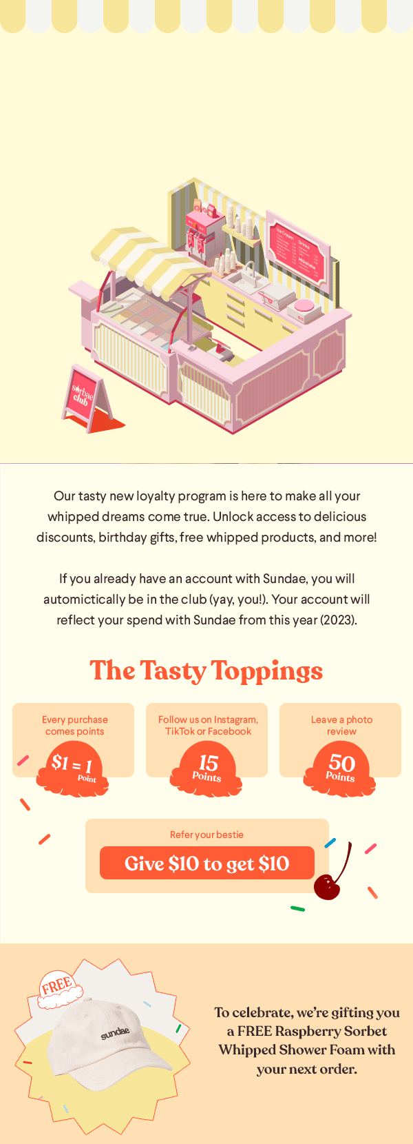
The Virtual Gelato Shop
To keep the branding cohesive with their physical products, we took the design of Sundae’s existing bundle box and translated it to the website. We paired this with a lively, custom 3D illustration of the "Sorbae Club" ice cream shop, complete with a striped awning and menu boards.
Instead of standard badges (like Bronze, Silver, Gold), we gamified the tier progression to mimic a real ice cream shop experience.
It starts with a simple spoon of ice cream—like getting a "tester" flavour.
As the user levels up, the illustration gradually increases until it becomes a full-on sundae in a glass bowl.
This visual growth perfectly signifies the more "delicious goodness" users unlock as they climb the ranks.


PHASE 2: WEB DESIGN
Designing a Delicious
User Experience
The Sorbae Club landing page needed to explain a complex point system without overwhelming the user. We designed a colourful, scrolling experience that feels like walking up to a fun ice cream stand.


PHASE 3: THE LAUNCH CAMPAIGN
Spreading the Word
(and the sprinkles)
To drive immediate sign-ups, we rolled out the Sorbae Club aesthetic across all digital touchpoints. We designed a suite of Social Media assets and automated EDM (Email) flows that teased the 3D cart illustrations and highlighted the sweet surprises waiting inside. By treating the rewards program like a major product drop, we ensured the launch was impossible to ignore.