INFINITY INCENSE — Brand Identity & Packaging Design
Elevating an Incense brand from Scent to Ritual
A comprehensive rebranding and packaging refresh for Infinity Incense, positioning the product as a premium "invisible luxury" for the modern sanctuary.
PROJECT SERVICES
★ Rebrand Package A: The Facelift
★ Add-on: Packaging Design
THE CONTEXT
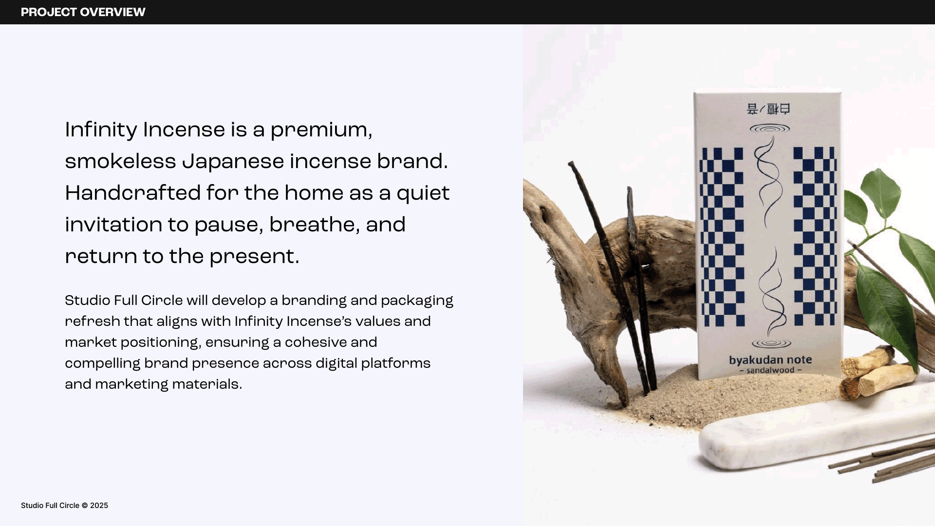
In an overstimulated world, the home is no longer just a shelter; it's a sanctuary. Infinity Incense creates premium, smokeless Japanese incense, but their existing branding didn't reflect the high quality of the product.
THE CHALLENGE
The goal was to move the brand away from being just another home fragrance and position it as a "quiet ritual". We needed to navigate a delicate balance: honouring the product's traditional Japanese roots while avoiding clichés, creating an aesthetic that felt at home in a contemporary living space.
PHASE 1: THE STRATEGY
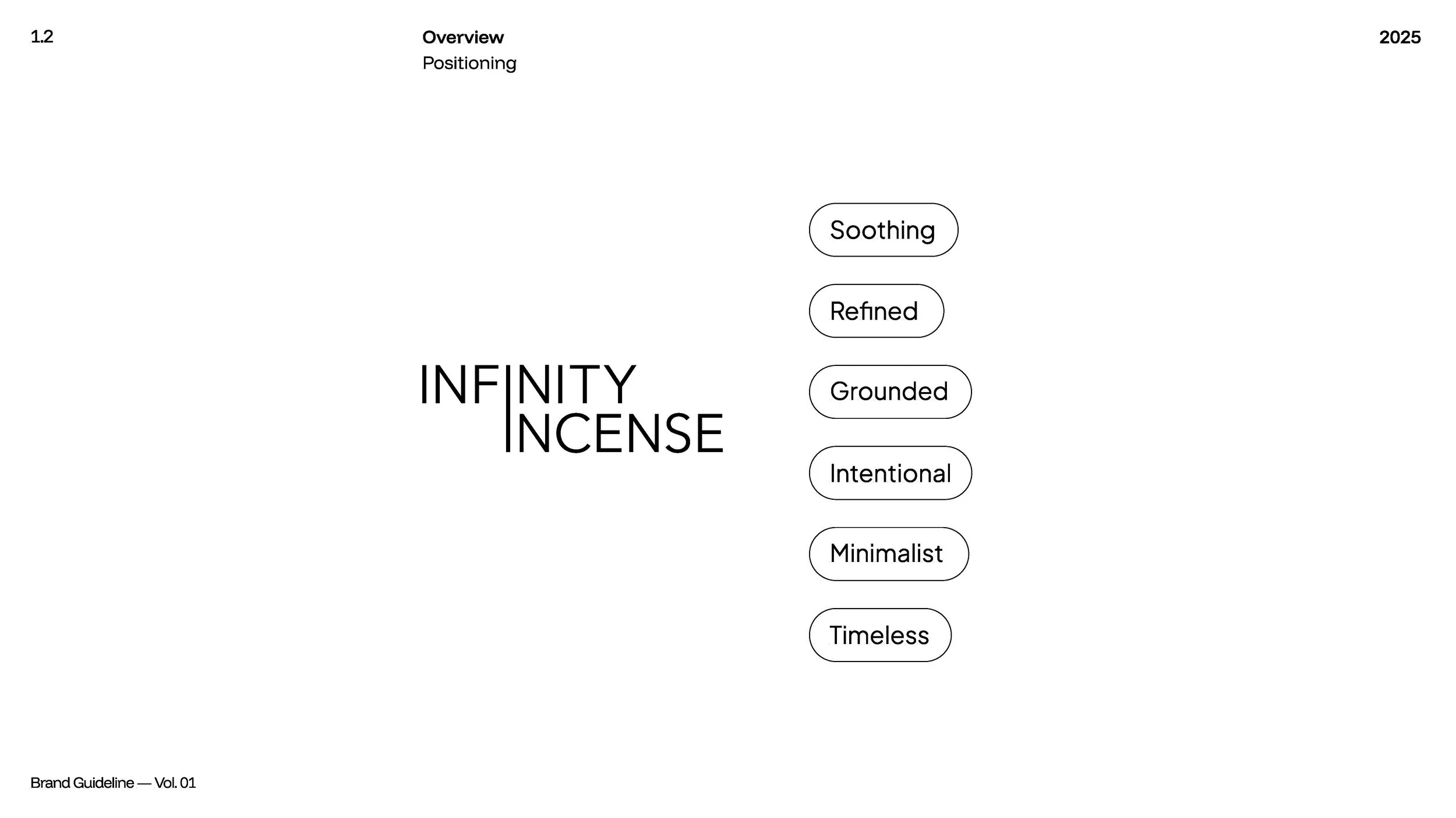
Defining "Quiet Luxury"
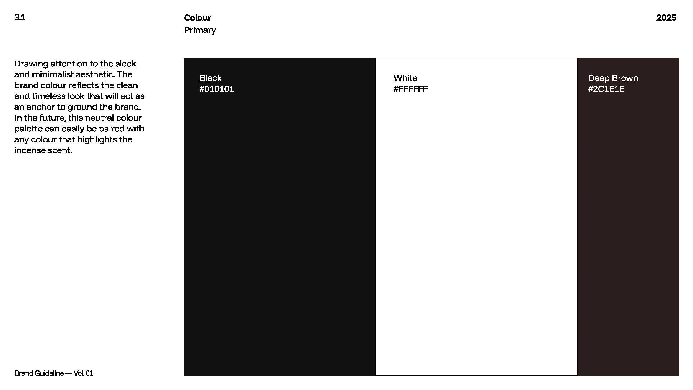
We started by defining a core identity rooted in Wabi-Sabi: finding beauty in simplicity and imperfection. The strategy focused on "Quiet Luxury," targeting consumers seeking intentional pauses in their day. We established a voice that is calm, poetic, and grounded, ensuring every touchpoint felt like a deep breath.
PHASE 2:”BEFORE & AFTER”
The Packaging System
The previous packaging was functional, but it lacked personality and the storytelling required for a premium shelf price. We stripped back the noise and introduced a system that feels like a collector's item.
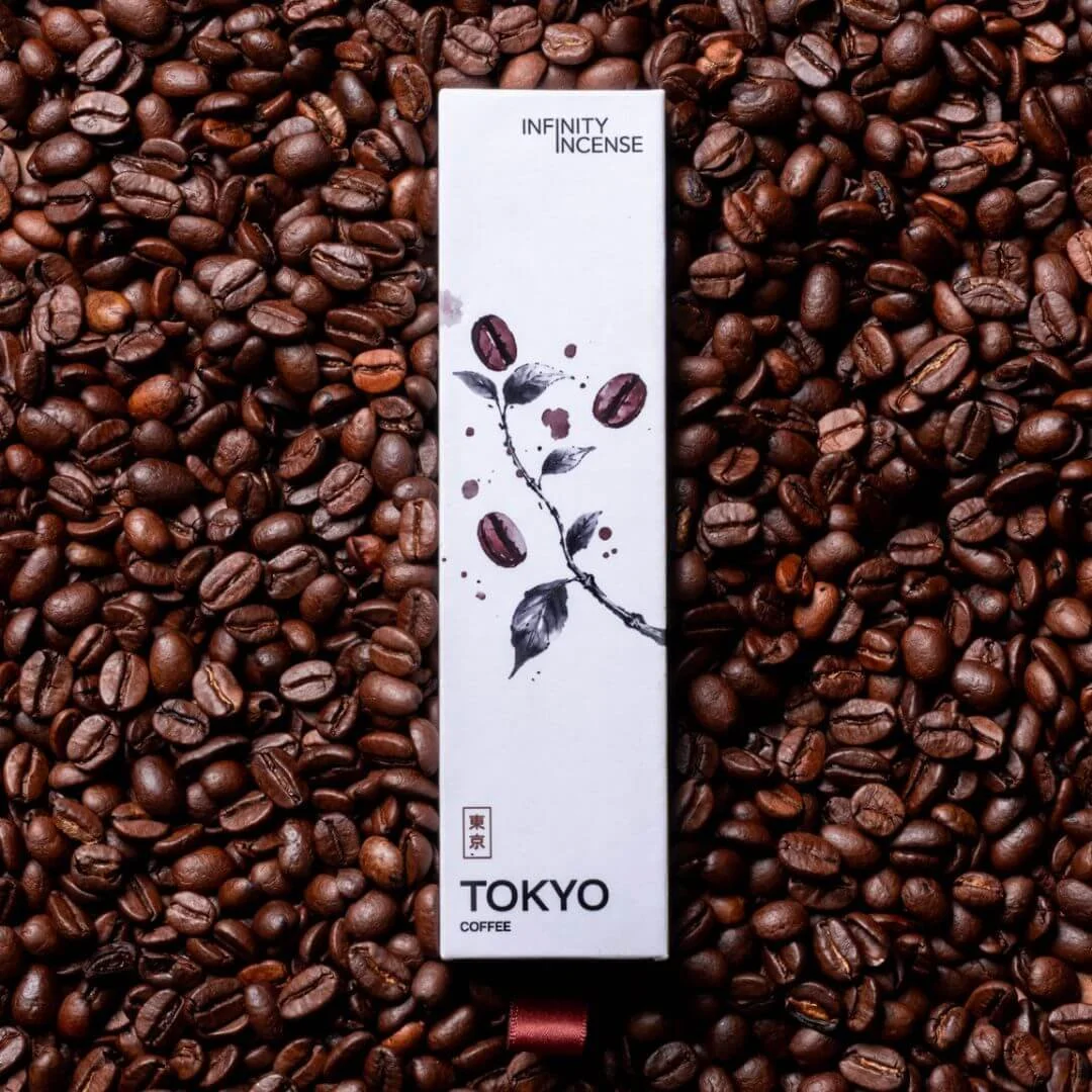
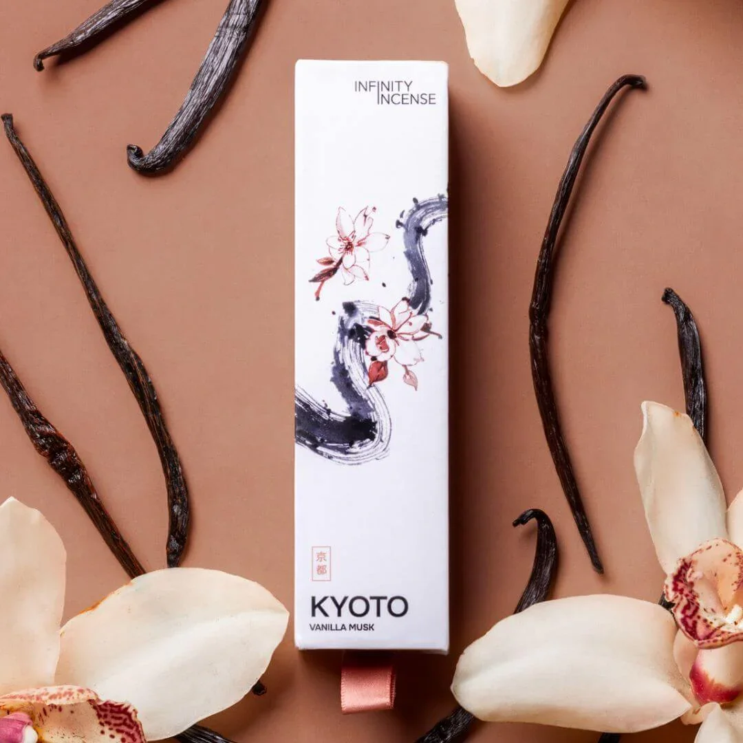
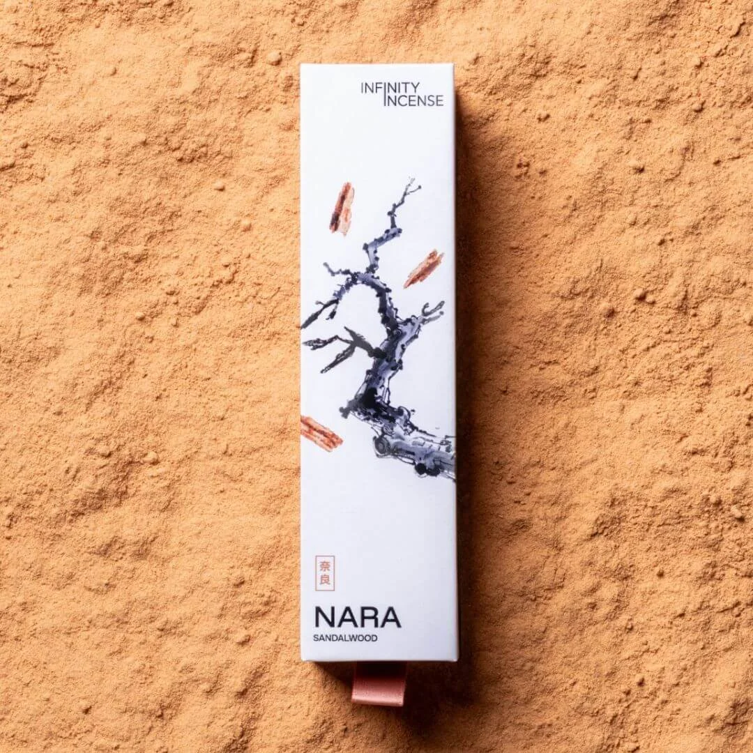
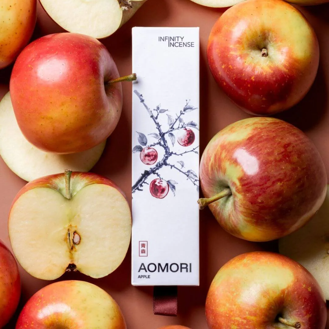
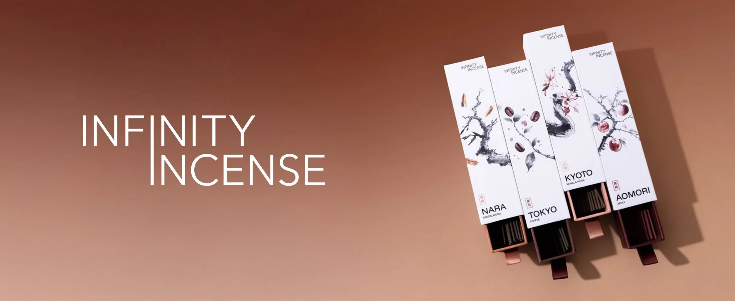
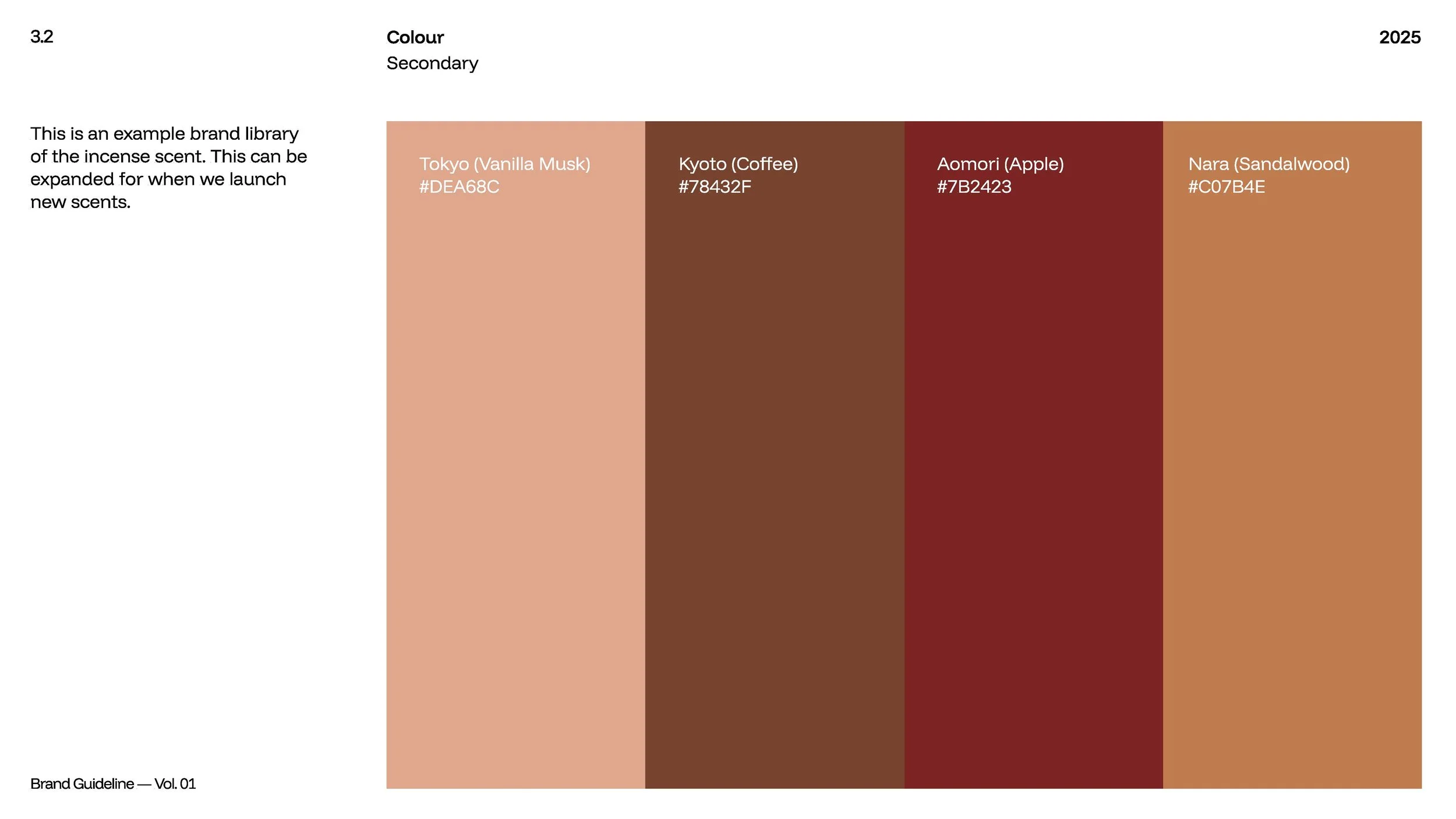
To visualise the scents without relying on literal product photography, we created a custom sumi-e (ink wash) style illustrations. Each scent features a unique illustrations that "flows" across the box, mimicking the fluid, smokeless nature of the incense itself.